Suriving Secondary School

This is my first ever blog!! Rocking Media for the first time ( and hoping it goes well)

Friday 19 April 2013

Sign Off


My Final Music Magazine: SoulMate


I'M DONE!!

I HAVE FINISHED MY MAGAZINE COURSEWORK!!!

THANKS FOR READING

BYE!!!  :)

Evaluation VI


Looking back at your preliminary task, what do you fell you have learnt in the progression from it to the full product?

What i learnt from the transition from the preliminary to the full product, is that there is a lot more details to creating a magazine that has much more of an effect on the reader, than i had previously realised. And also how long the magazine process actually was. The code and conventions of a magazine are really important to show the genre and to show the target audience directed to. I dont think that I understood that with the preliminary task, which is why it looks more like a picture with words on it rather than a magazine.

i also learnt what an impact that the image has upon the reader when your first look at the magazine. On the preliminary my picture was quite dark and there was no direct address so the cover wasn't very attractive, whereas with the real thing was bold, bright and the actual gesture of the model actually attracted the reader into wanting to read the magazine.

What is definiately clear is that i have improved greatly, with my skill both in creating and editing pictures and also in using different technologies to create the images.

Evaluation V


What kind of media insitiution might distrubute your media product and why??


Thursday 18 April 2013

Evaluation IV


In what ways does your media product use, develop or challenge forms and conventions of real media products?

Follow this link....


Thank You :)

Evaluation III


What have you learnt about technologies from the process of constructing this product?


Adobe Photoshop

This was one of the technologies that i used quite regularly for my photos. I had used it previously before for my photography but i had never used it to the degree that i had used it when creating my media magazine. Photo shop is a 'graphic editing programme' ( source: wikipedia.com) which allows you to manipulate, style and improve your pictures, through a variety of different tools and applications.


Front Page

Before                                         After

I did my entire front page on photoshop, along with the preliminary task and the planning of the main magazine and this just proof of how effective the programme actually is. This programme enhanced my pictures to make them look even more proffessional. And above all, it was suprisingly easy to use, as many of the tools are fashioned in such a way that it becomes immediately obvious what they do. Tools like the magic wand tool which i had never used before allowed me to move elements of a picture from one part to another and have it actually look like a real picture.


 Google
Blogger

Google blooger is a blog publishing service that allowed me to present all the findings and creations of my music magazine. I had never used a blog before and  i was amazed to learn how eay it was to use. There were lots of helpful tools that made it easier to both present your findings and also to connect with the audience and find out what they are thinking. This could be achieve in tools such as the polls which give me an exact idea as to what is popular and what isn't a good idea.

i also learnt about the freedom it gave you as a blooger which was a lot. It allows you to literally write whatever you want, giving you total control over what you put on your blog. It is so free that it doesn't even have spell check ( which isn't as useful for a hopeless speller). And in this freedom, i learnt that i was able to show all my work as a journey from start to finish clearly.

Microsoft Publisher...

This is a software the focuses on mainly the page layout for stuff like advertising and marketing. Its designed to make texts etc look much more interesting. What was amazing about this software is that it already has some templates made out for you ( despite the fact that they weren't appropriate for the magazine) such a banners and posters. The software as a whole was really easy to use, with loads of tools to help you make you magazine. I made my Double Page Spread and my Contents page on publisher and the programme was really helpful as it provided guidelines to help my magazine look nice and neat and proffessional. What i definitely learnt about publisher is that it doesn exactly what you want it to.

Evaluation II


How does your media magazine represent particular social groups???


Thank you!!! :)

Evaluation


To see the questions...

1) Who would be the audience for you media product ( magazine)?
2) How does it attract your audience?


Wednesday 27 March 2013

Final Contents Page Draft!!!


This is my final Draft for my contents page.
 
 
I have added all of the features that i want. I intended it to be plain and simple but with an attractive link to the rest of my magazine.


Monday 25 March 2013

Contents Page II


I think so far that my contents page is going well. I think it has all the conventions associated with a contents page and so far the layout looks good. However there is an issue with the lines at the top of my page.


I used the lines underneath the words 'contents' because i wanted to maintain the house style of the magazine and maintain the retro look that i have place through the entire magazine. However, despite it's link, it does make the word contents look a little unclear and so i need to decide whether to keep or get rid of the lines

With the Lines


Without the Lines


What do You think???????

Leave a comment in the Comment Section!!!

Thursday 21 March 2013

Final Double Page Spread Draft!!!


This my final draft for my double page spread. Much like the font cover, i changed the main fonts so that it would look more mature to attract my target audience.


Tell me what you think??
 
 
In the comment section!!! :) 

Wednesday 20 March 2013

Contents Page

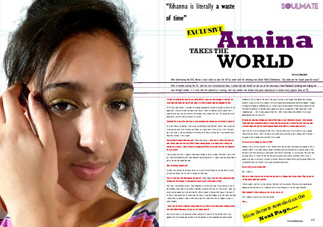
From the begining, I thought that the contents page was the hardest thing to do out of all three of the pages as there is much more to put and organise. I thought it was important to maintain the progression of the magazine and so i made the contents masthead the same style as my orignal masthead of SoulMate. Much like the double page spread, it was hard to find a picture that would work well with the shape of the page, as so i has to change my plan to make sure the page fitted together.
Also to help position my page, i used Publisher's guidelines tools, to make it look more professional.


Creating My Double Page Spread III


After the last draft, i adjusted the size of my soul mate and because of that i am now able to adjust poistioning of the main masthead. Also since the last draft, i have added more of my article using the red and black to contrast the interviewer and the interviewee.

Creating my Double Page Spread II


Creating the my double page spread, after adjusting the picture, the rest of the magazine seem to fall into place. I have used a four collumn set up to place everything into and and the colour scheme is co ordinated with both the model and the colour scheme of the magazine. My only issues so far is that i think that the mast head at the top is a bit too big and stand out too much on the page and also my font style i think looks a bit too childish for my age group.

Monday 18 March 2013

Creating my Double page Spread


After establishing what i wanted to do in my drafts, i had to start creating my double page spread.

I hit trouble from the begining.

I had trouble finding a picture that would fit perfectly on the page.

This was my first choice for my double page spread. I think this is a clear attractive image of Amina that could clearly dominate the page. However the major problem was that her arms and head cut off at some point meaning that the image wouldn't fit on the page like i wanted it to. Taking up one side of the double page spread.


I think moved on to this picture ( right) which i think clearly showed Amina, was bold and inviting and worked perfectly on the page. However, the image itself was way too similar to my front page image and so i had to abandon it to show that i can use a wide range of images.


On the page, ( once it had been adjusted slightly) the image looked perfect, fitting perfectly on the page with lots of space to right and yet a clear focus on the artist.


Friday 15 March 2013

Final Front Page Draft!! Finished Article!!


I went around to get some feedback for my colour dilemma. This is what was said

"Out of all of them, i think i prefer the black as it stands out more on the page and yet works with the rest of the colour scheme"
 
"Definitely the Black! It looks better than the others and looks more like a magazine"
 
Given that the majority of the people i had spoken to prefered the black, i decided to keep it. Which mean that my front page is now FINISHED!!!


DO YOU LIKE IT????

TELL ME WHAT YOU THINK IN THE COMMENT SECTION!!!


Thursday 14 March 2013

Front Page Draft 4

 
Once i changed the font style of the front cover , i gathered some feedback from people.
 
" I like it so far. I think that the image and the mast head work really well together and the font styles work well as a whole on the page. The only problem i see is the black colour on some of the features. I don't think it works well with the other colours"
" I love the model's nails. i think that is really unique for a magazine."
" You can really see that Soul/retro theme"
 
 The only major issue that they mentioned was the fact that the black stood out a bit too much in comparison to the other images. I had a real issue trying to find a colour that worked well with both the page and with the purple.


What do YOU think???
Which should I PICK???
Leave a COMMENT in the comment section


Wednesday 13 March 2013

Front Page Draft 3

I changed my cover lines. As I developed the magazine further, i didn't like the font and style of my coverlines. I thin they were too childish and wouldn't appeal to my target audience. So i changed the font style, giving it a more mature feel. 


What i liked about this magazine and what i want to incoporate into my magazine is this idea of hiearchy. In this Vibe magazine, they layer the coverlines to show the most important feature. I really like this idea. and it is something that i want to use.

Front Page 2nd Draft


I am much happier with my magazine now, as i feel i looks more like a magazine!! The colour scheme looks great and i really like how the image works with the page. My only issue is the coverlines and how not all of them seem to fitt on the page!! i was hoping that i could avoid covering the model with coverlines and so i will move the coverlines around to suit this idea

Saturday 9 March 2013

First draft (Front Page)


I am really happy with the beginings of my magazine. I think i have found the perfect picture that works well with the front page and also with the colour scheme. I had a bit of difficulty getting the masthead as perfect as i wanted it, however it worked out well as the masthead fits perfectly with the page and i like the way my image overlaps the masthead, just in the 'o'.
 
 
I didn't realise until after editing the picture that Amina's nails were not fully painted and then I was left with the choice to either edit over the them to make them clear or leave them as a symbol to my audience. I decided to keep the nail because it sends a different representation of the my model to the audience. It says to the audience that amina is a real person much like the readers.


Sunday 3 March 2013

Manipulating My Pictures!!

Before ......

This is the original picture, before photoshopping. I think i is a very good picture as it is already nice and bright and i think it is perfect for a front page.


After.....

In photoshop, i didn't think i needed to do much so all i did was increased the brightness and saturation giving the image that warm feel and taking my main model and putting her on a white background which i feel is easier to work with.

Thursday 28 February 2013

Masthead Styles and Font Styles.


I discovered from the polls that the most popular mast head name was SOULMATE!. So i began editing......

Masthead One...


This masthead, I think is my favourite because it contrasts so well with the colour scheme. Just
looking at it, it's very eye catching and i think that it would stand out amongst the rest of the magazine. Additionally i think it give a unique take to the original styles of the genre. Normally when looking at a music magazine in general, as well as a soul magazine, there is very little variation in the styles of the masthead. Most use block simple fonts that stand out on the page. However i feel that this masthead is just as effective as the others in catching the eye of the reader.


Masthead Two....


This masthead is very similar to the previous masthead, with reverse colouring which also creates contrast. There are also very few lighter masthead, giving it a unique edge. However, this only downside to this masthead is that, in comparison to number one, it doesn't stand out and i feel that it would blend in to much with the rest of the page, meaning that it will barely be seen on the shelves.


Masthead Three...


This, i have been told, is the best one out of the three. Once again, it fits with the colour scene and particularly with a white background, i think it would the most effective and would go with the picture more effectively.


Font Style    Font Style


 This is the font style that i have chosen for the writing throughout the entire magazine. I think that this font is clear and effective for the younger and older readers. Also it is not too intimidating in the sense that it isn't too professional. If it were, i think it would create the image that it is for adults and that it would contain language and information beyond the readers. This clear writing shows that it can be read by anyone and that it isn't not beyond them.


Colours.


There were many colours that I was considering for my magazine. What I was sure of from the begining was that i wanted contrast colours, particularly for the front page.


The Colour Scheme for My Magazine


       Purple

                                               Black

                                            Creme


                                             White


Navy Blue

There were of course other colours that I considered....


I may use these colours throughout the magazine to further contrast and seperate features from others. However i felt these colours stood out too much within the colour scheme and almost weren't appropiate for the genre of music that I was doing.


I think that my colours in general    
are more complimentary as they seem to work together create one smooth look for the cover magazine and the cover wont be too colour filled and too much for the readers to look at.

Styling


The image of the magazine is very important. The magazine needs to look good, otherwise it will not attract any readers. The Masthead is one of the biggest attractions/ references for the front page and so deciding on the name and the style of font is very important.

Different STYLES!!

I tried out different styles to see what the most attractive font is to use for my soul style magazine.


Which do You prefer???????????

tell me in the comment section...  :)