Suriving Secondary School

This is my first ever blog!! Rocking Media for the first time ( and hoping it goes well)

Thursday, 28 February 2013

Masthead Styles and Font Styles.


I discovered from the polls that the most popular mast head name was SOULMATE!. So i began editing......

Masthead One...


This masthead, I think is my favourite because it contrasts so well with the colour scheme. Just
looking at it, it's very eye catching and i think that it would stand out amongst the rest of the magazine. Additionally i think it give a unique take to the original styles of the genre. Normally when looking at a music magazine in general, as well as a soul magazine, there is very little variation in the styles of the masthead. Most use block simple fonts that stand out on the page. However i feel that this masthead is just as effective as the others in catching the eye of the reader.


Masthead Two....


This masthead is very similar to the previous masthead, with reverse colouring which also creates contrast. There are also very few lighter masthead, giving it a unique edge. However, this only downside to this masthead is that, in comparison to number one, it doesn't stand out and i feel that it would blend in to much with the rest of the page, meaning that it will barely be seen on the shelves.


Masthead Three...


This, i have been told, is the best one out of the three. Once again, it fits with the colour scene and particularly with a white background, i think it would the most effective and would go with the picture more effectively.


Font Style    Font Style


 This is the font style that i have chosen for the writing throughout the entire magazine. I think that this font is clear and effective for the younger and older readers. Also it is not too intimidating in the sense that it isn't too professional. If it were, i think it would create the image that it is for adults and that it would contain language and information beyond the readers. This clear writing shows that it can be read by anyone and that it isn't not beyond them.


Colours.


There were many colours that I was considering for my magazine. What I was sure of from the begining was that i wanted contrast colours, particularly for the front page.


The Colour Scheme for My Magazine


       Purple

                                               Black

                                            Creme


                                             White


Navy Blue

There were of course other colours that I considered....


I may use these colours throughout the magazine to further contrast and seperate features from others. However i felt these colours stood out too much within the colour scheme and almost weren't appropiate for the genre of music that I was doing.


I think that my colours in general    
are more complimentary as they seem to work together create one smooth look for the cover magazine and the cover wont be too colour filled and too much for the readers to look at.

Styling


The image of the magazine is very important. The magazine needs to look good, otherwise it will not attract any readers. The Masthead is one of the biggest attractions/ references for the front page and so deciding on the name and the style of font is very important.

Different STYLES!!

I tried out different styles to see what the most attractive font is to use for my soul style magazine.


Which do You prefer???????????

tell me in the comment section...  :)

Monday, 25 February 2013

How to set out my Magazine?


Deciding how to set my magazine is really important. The layout of the magazine is meant to indicate the purpose and genre of the magazine. For Example, Sugar magazine would be layed completely differently to The Radio Times as they are meant to be attracting a different target audience. The layout has to encoporate both size, colour, graphic and font appropiate to the style of the magazine. This means that any mistakes can have a huge impact on pricing and audience popularity. I am planning to not only do a double page spread, but a double page contents page, to showcase even more of my features!!

Layout Design One!!


I like this one because i think the image and the positioning of the writing makes the genre really clear.


Layout Design Two!!
This layout, i think is more typicial of a music magazine, particularly with the positioning of the pictures.
 
 
Layout Design Three!!


Even though these are just rough designs, it's still difficult to choose which I should use. They all have good and bad qualities to them.
 
Help!!!!Comment!!!

Treatment


SoulMate!, the new music magazine.

Target Audience Readers: SoulMate! is a new music magazine for teenage girls aged from 16 to 20. It's not aimed at a particular kind of girl and so it can be read by anybody. The music magazine is traditioanlly based around Soul/RnB genre of music and yet on occasion can stray onto other genres such as Rap or Classic Motown or Blues/Jazz, along with the mainstream rnb music of the time.


The readers of SoulMate! would be accustomed to the equal content between genders, because they live in a time where equal rights are expected. They enjoy the straightforward media content that SoulMate! displays, provides entertainment and enjoyment for mainstreamers, the more selective readers and those searching for new talent to benefit from. Additionally, the reader look forward to celebrity interviews within the magazine, as they can look to them for inspiration, confidence and as role-models. But also for someone who appreciates not only modern music but the impact that past music has had on today and how music has developed, loving the changes in beats, styles and rhythms. A SoulMate reader is fun and adventurous. They are willing to try anything and willing to experiment and try out new sounds and ideas, taking on board different perspectives and ideas. They are open minded and bright, being determined to be successful. A SoulMate! Reader ranges from slight unconfident, looking to the magazine for a confidence boost in the ambitions and opinions towards music, to confident, looking to the magazine to find new sounds and be willing to voice their own opinions. The reader takes part in a wide range of activities but has a strong passion for music. They play all kinds of instruments and looks to the magazine to explore and develop their music knowledge. However, the reader possess a strong desire to sing, maintaining not only an interest in talent shows such as the Voice but going out into the world and experiencing the thrill of taking part in live competitions and singing in front of live audiences. Most important, SoulMate is for someone who dreams big. They want the world and they are determined to get it, seeking everything they want out of life.

Styling

SoulMate! Is an A4 coloured magazine, containing mostly gossip and interviews from the soul/rnb world. It also looks back onto past music and its influences, along with recognising new sounds and movements and appreciating a new artist’s addition to the music world. It will also expand it audience through fashion, beauty, reviews and also personal and musical advice and guidance. Modelling on the cover will consist of celebrities and in the moment people in the music world, with no particular age range but based more on popularity/familiarity with the target audience. Each cover will display an ‘in the moment’ celebrity such as Joss Stone or Justin Timberlake, appealing to both genders and providing role models for both, along with talent show competitors ( such as X Factor star) being included.  The colours scheme consists of bold such as Red/Blue/Black/Purple (Orange/yellow occasionally), yet often using the colours to contrast with a white background.  The cover lines will include contemporary issues that will interest ever gender and is relevant to both current musical issues and to the genre, along with competitions and columns to encourage audience participation and free stuff to attract them.  The front cover itself will have a neat clutter look so that it is attracting, and look worth it yet not be too loud for the reader to look at, with bold and clear graphics. The pricing of the publication will be £2.50, an affordable for price, which is a little bit less than the average pricing making it more value for money.

Themes 

SoulMate will maintain the main themes within a teen music magazine such as fashion beauty health, along with celebrity news and music/film/book reviews. However not only will the magazine include that but it will also focus on upcoming artists, how they came about, with advice on becoming famous and focus in detail on some of the greatest music stars giving close analysis of their life achievements. There will be a strong focus on relationships from both a boy’s and a girl’s perspective, providing insight into the other person mind, encouraging strong relationship and strong friendships. The magazine will also feature real life issues along with different styles of rnb, creating diversity within the genre and encouraging other to look into different artists, enhancing their music knowledge.  The writers of each article will use common language so that messages can be easily conveyed and the articles can be enjoyed by all easily and creating interest.

Advertiser

The magazine adverts will range from fashion stores such as Top Shop or next but also advertise brands such as Converse, Nike.  Beauty and Health will be advertised regularly from brands such as Superdrug, The Perfume Shop and Nivea.  Adverts include affordable products for the readers of the magazine. Music will be mostly advertised though with Concert, Albums and Artists heavily endorsed.

Editorial Team

The team will be made up of a wide range of writers and designers all with experience from magazines such as Vibe and Q, also with advisors from magazines such as Soul Underground for the genre. With a mixed gender team, SoulMate can include a mix of new ideas appealing to both genders in our target audience.


Thursday, 14 February 2013

My Photoshoot Pictures


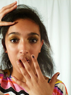
During my photoshoot, using amina, i experimented with different angles and poses in order to find the perfect image for my magazines.


 My only issue with my pictures is that my lighting was a little off and so in some pictures the lighting is perfect and in others the pictures looked a little yellow. Also i did accidently get in the background, bits outside of the screen. But overall i am very happy with the pictures i have taken.


Saturday, 26 January 2013

Photoshoot Plan


Photoshoot Plan

Camera Angles- The majority of the shots will be mid shots, as i feel it is unecessary to show too much of the model if it isn't related to the article title.

Front page- i think a close up on the face would be very effective in standing out on the page and clealry showing the endorsement of the model. Also ( if necessary) it can easily convey emotion and make the model dominate and the focus of the page.
Contents page- I think the main feature image should range from a close up to a mid shot ( from knees and above) so the main focus is clear. To convey the genre of magazine, my band image will be taken with headphones on,  to also make the next biggest feature clear.

Double Page Spread - The main image, i think, must be dominate on the page so i will be using a high angle shot to make the model look bigger and to show the dominance i want. To further show the dominance of the model, the left side of the page will be filled with one image of the model, meaning the photo must have an effective use of space, both making the focus clear but also possesing the ablity to add plugs on the sides. n

Model- The main purpose of SoulMate! is to show cultural diversity within one genre. To say that any person can enjoy soul music, not matter what cultural background. I will be using 3 models, one single focus and the other two to be a band image. Using Amina i think will create that feel and also her features and general persona gives off a musical vibe for the audience to pick up.

Styling- The main magazine background will be white and so i want colours to make the model really stand out in comparison to the background of the magazine. Preferably i want the model to match the colour scheme but as the background is white the model can be adjusted to fit the magazine colour scheme.

Setting- The magazine main pictures are not intended to give off a particular message about the focus of the pictures and so using a white background gives off that effect. I want the model to be the main focus and the only focus of the picture and i feel that having a specific background will distract from the main focus.

Lighting- I want bright lighting to make the focus really clear on the page. Also by using bright lighting, it creates a happier brighter feel to the magazine, conveying the message that the magazine is something to be enjoyed.