Suriving Secondary School

This is my first ever blog!! Rocking Media for the first time ( and hoping it goes well)

Wednesday, 27 March 2013

Final Contents Page Draft!!!


This is my final Draft for my contents page.
 
 
I have added all of the features that i want. I intended it to be plain and simple but with an attractive link to the rest of my magazine.


Monday, 25 March 2013

Contents Page II


I think so far that my contents page is going well. I think it has all the conventions associated with a contents page and so far the layout looks good. However there is an issue with the lines at the top of my page.


I used the lines underneath the words 'contents' because i wanted to maintain the house style of the magazine and maintain the retro look that i have place through the entire magazine. However, despite it's link, it does make the word contents look a little unclear and so i need to decide whether to keep or get rid of the lines

With the Lines


Without the Lines


What do You think???????

Leave a comment in the Comment Section!!!

Thursday, 21 March 2013

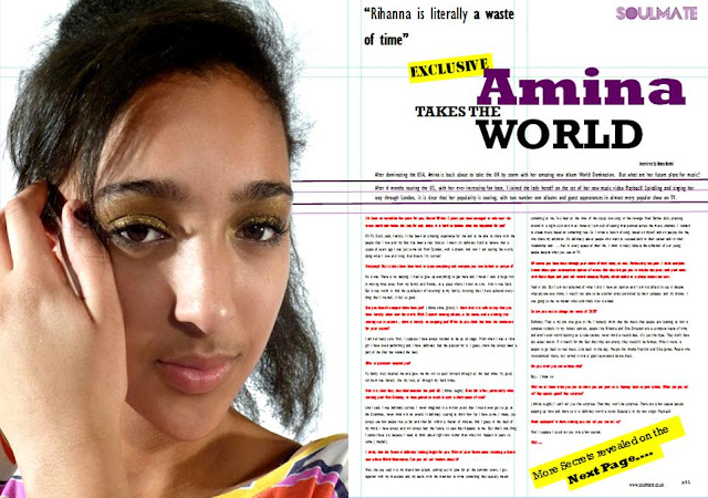
Final Double Page Spread Draft!!!


This my final draft for my double page spread. Much like the font cover, i changed the main fonts so that it would look more mature to attract my target audience.


Tell me what you think??
 
 
In the comment section!!! :) 

Wednesday, 20 March 2013

Contents Page

From the begining, I thought that the contents page was the hardest thing to do out of all three of the pages as there is much more to put and organise. I thought it was important to maintain the progression of the magazine and so i made the contents masthead the same style as my orignal masthead of SoulMate. Much like the double page spread, it was hard to find a picture that would work well with the shape of the page, as so i has to change my plan to make sure the page fitted together.
Also to help position my page, i used Publisher's guidelines tools, to make it look more professional.


Creating My Double Page Spread III


After the last draft, i adjusted the size of my soul mate and because of that i am now able to adjust poistioning of the main masthead. Also since the last draft, i have added more of my article using the red and black to contrast the interviewer and the interviewee.

Creating my Double Page Spread II


Creating the my double page spread, after adjusting the picture, the rest of the magazine seem to fall into place. I have used a four collumn set up to place everything into and and the colour scheme is co ordinated with both the model and the colour scheme of the magazine. My only issues so far is that i think that the mast head at the top is a bit too big and stand out too much on the page and also my font style i think looks a bit too childish for my age group.

Monday, 18 March 2013

Creating my Double page Spread


After establishing what i wanted to do in my drafts, i had to start creating my double page spread.

I hit trouble from the begining.

I had trouble finding a picture that would fit perfectly on the page.

This was my first choice for my double page spread. I think this is a clear attractive image of Amina that could clearly dominate the page. However the major problem was that her arms and head cut off at some point meaning that the image wouldn't fit on the page like i wanted it to. Taking up one side of the double page spread.


I think moved on to this picture ( right) which i think clearly showed Amina, was bold and inviting and worked perfectly on the page. However, the image itself was way too similar to my front page image and so i had to abandon it to show that i can use a wide range of images.


On the page, ( once it had been adjusted slightly) the image looked perfect, fitting perfectly on the page with lots of space to right and yet a clear focus on the artist.